Research Evaluation Document
Document LinkIngredients
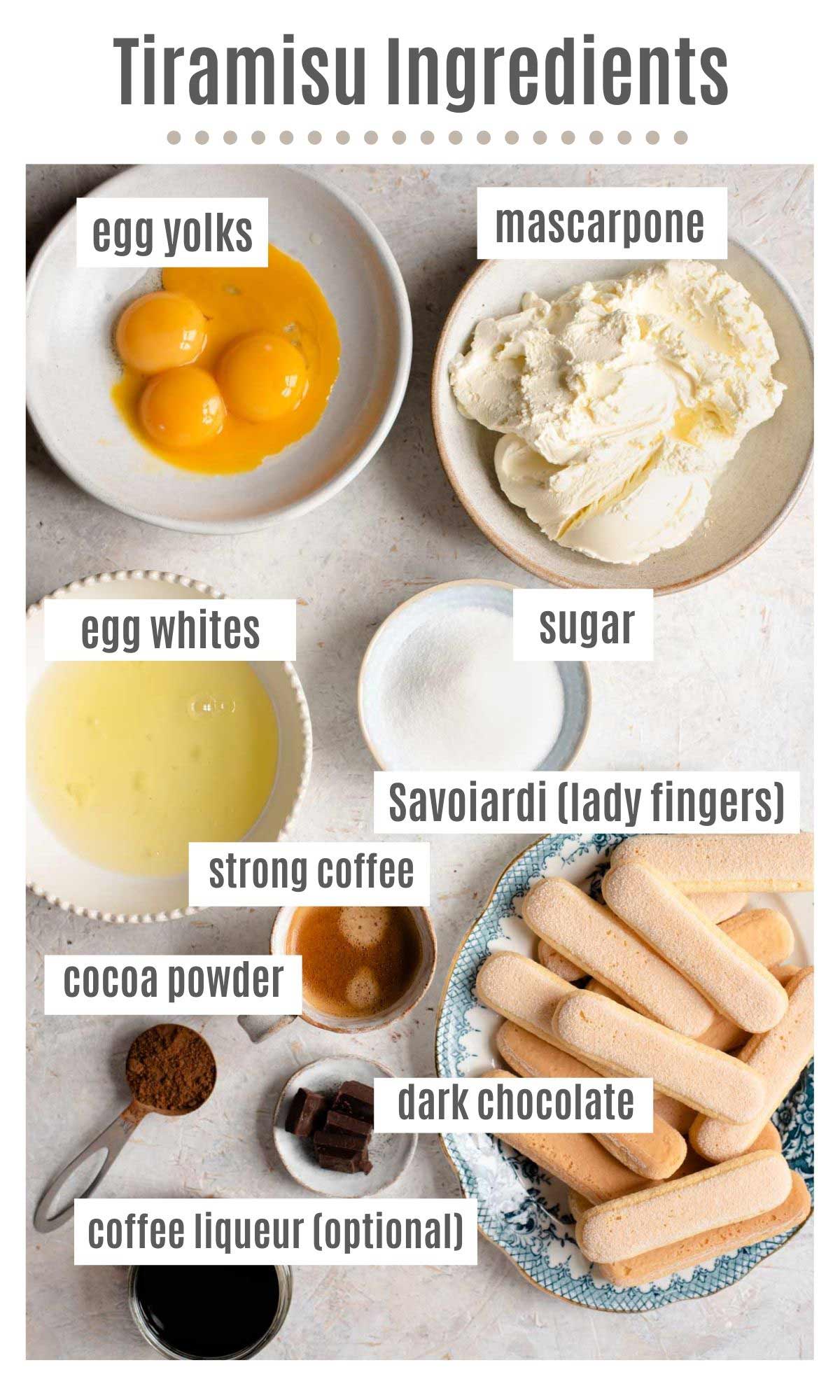
- 6 egg yolks
- 3 tablespoons sugar
- 1 lbs mascarpone cheese
- 1 1/2 cups strong espresso (cooled)
- 24 packaged ladyfingers
- 1/2 cups dark chocolate shavings
- Cocoa Powder
Equipment
- Large bowl
- Shallow bowl
- Electric mixer
- Measuring Spoons
- Large container (to store the tiramisu)
- Plastic wrap (if container doesn't have a lid)
Total Time: 2 hours 25 Min
Prep time: 25 min
Inactive Time: 2 hours
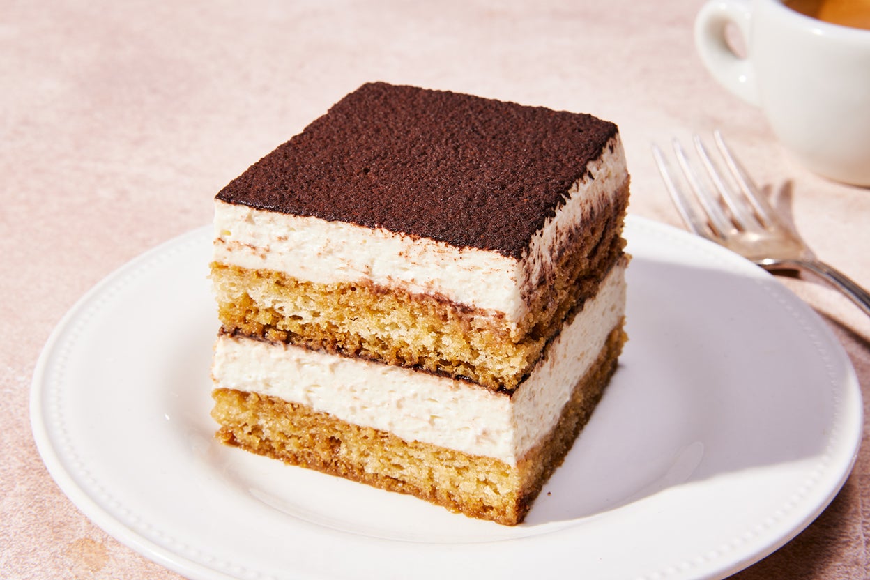
How To TIRAMISU!!
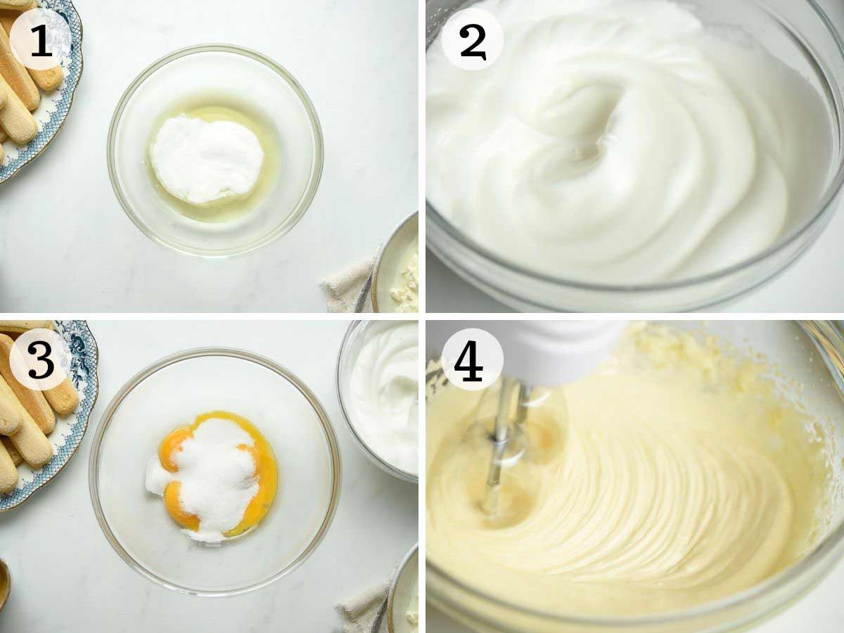
- Divide the egg yolks and egg whites in two separate bowls and add 1.5 tablespoons of sugar to each. Whisk the egg whites until they are stiff and glossy. Continue with the egg yolks and whisk those with an electric whisk until pale and thick
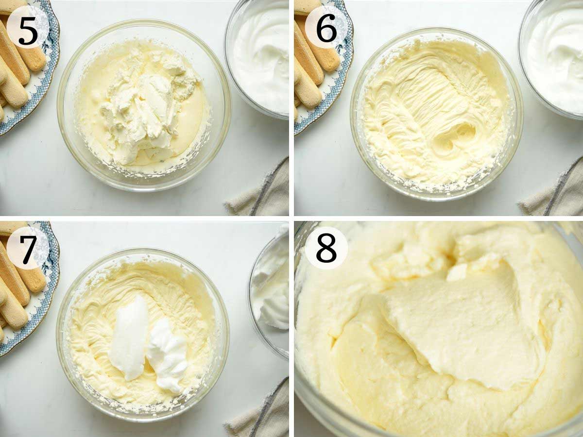
- Add one-third of the whisked egg whites to the mascarpone mixture and gently fold it in as you would with a cake batter. Continue with the remaining whites a third at a time until it's completely incorporated
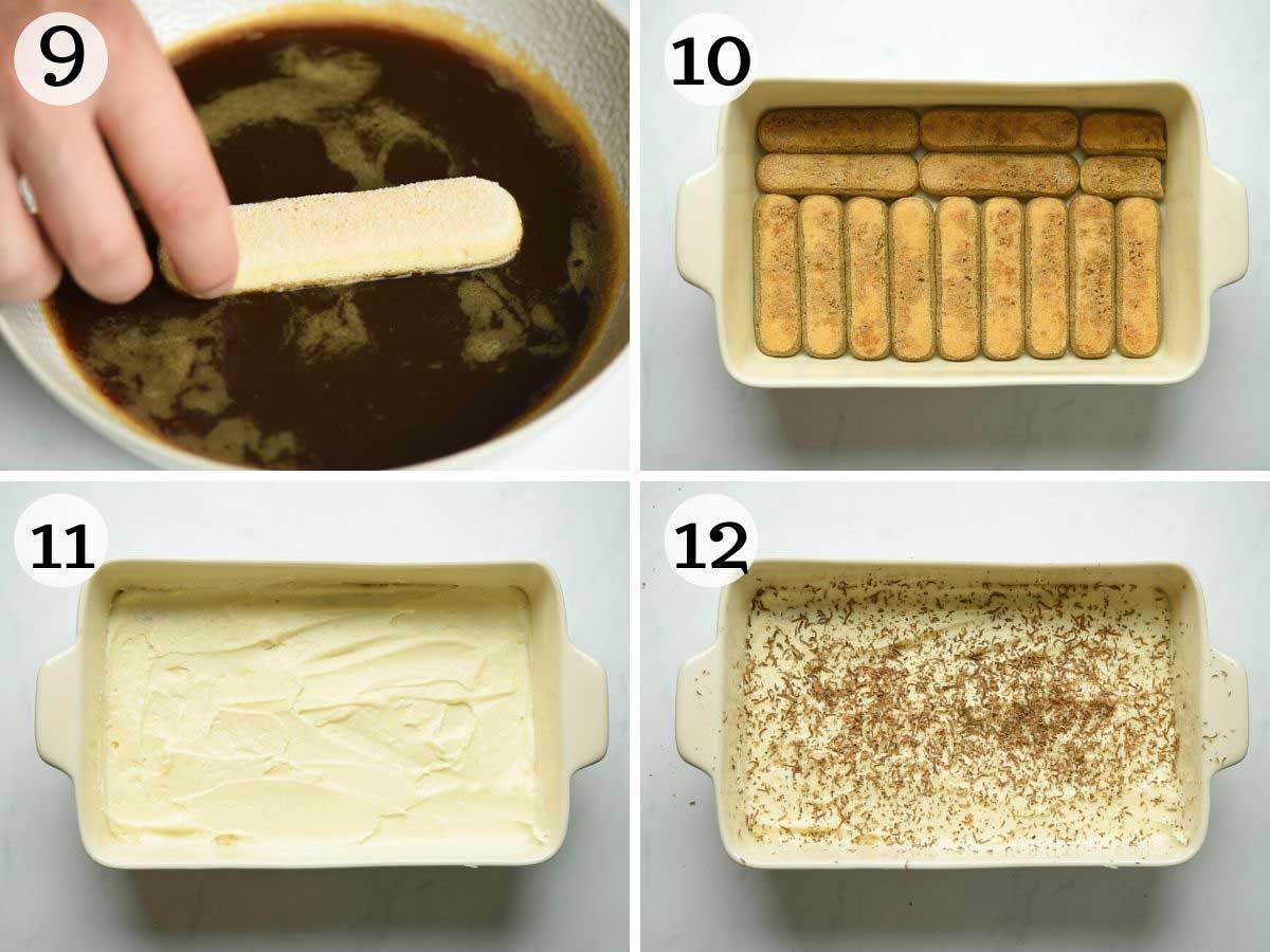
- Mix the espresso in a shallow bowl and dip in the Savoiardi ladyfingers for 1-2 seconds on each side and line them on the bottom of the dish in an even layer
- Add half of the mascarpone mixture over the ladyfingers and spread out in an even layer, top with some grated dark chocolate
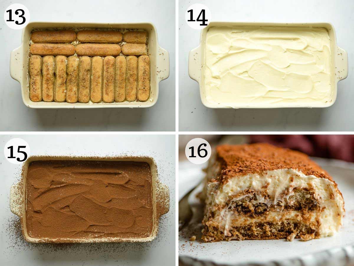
- Repeat with a second layer of soaked ladyfingers and mascarpone as directed above. Finally, dust with cocoa powder and chill in the fridge for roughly 6-8 hours
- Serve it as soon as you take it out of the refridgerator and enjoy!
Images
Recipe Websites
- Budget Bites
I liked the consistent use of design elements of a yellow box shadow/yellow highlights because it makes the website more cohesive. There is a funciton where you can input the number of servings you want to make, and the website automatically adjusts the amount of ingredient you need, which I thought was very nice. Overall, the website is very informative in the sense that they have nutritional information, tips, list of equipments, and the time it takes to cook the meal
- Bon appetit
I really appreciate the simplicity of the design. There is minimal text and you don't have to scroll as much. to see the full instructions. I think the videos are very effective and I liked how they bolded the text of ingredients that appear in the instructions.
- Recipetineats
I like how they began each instruction with a bolded phrase that summarized the next step. They repeat the instructions without the images again at the end of the website to accomodate for people who just want to read without any distractions. Lastly, they put the ingredients with check boxes, which allows the user to cross off the ingredents while they are grocery shopping.
Non-Recipe Websites
- Airbnb
I really like their use of grid space for the information and how they put lots of images at the beginning of the page. I like the rounded corners of all the boxes and its easy navigation.
- Jones BAR B Q
I like the general design of the website. They prompt user interaction by using big bold texts that cover up the entire page. There is a clear brand style guide in terms of color and font family, which makes the website very cohesive.
- North Face
This website makes me feel that sometimes less is more. I appreciate that there aren't animations every time I scroll because it allows me to focus on the content more. I like how they have two pictures for each product, a close up shot and a general shot, which I think is very helpful for the users.